Land Cover Change Analysis with Python using ESA CCI
In this tutorial, we'll analyze land cover change for a region of interest using QGIS plugins and Python. We'll focus on Ñuflo de Chávez in Bolivia, tracking changes from 1992 to 2020.
Step 1: Download ESA CCI Land Cover Data
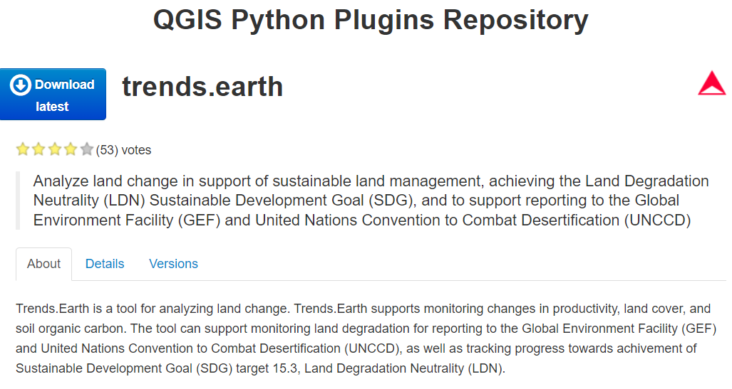
First, install the trends.earth plugin from the QGIS Plugin Manager:
Once installed:
- Open QGIS and navigate to Plugins → trends.earth
- Select Download data → Land cover
- Choose your area of interest (in our case, Ñuflo de Chávez, Bolivia)
- Select the years of interest (1992 to 2020)
- Download the data as GeoTIFF files
Step 2: Understanding the ESA CCI Classification System
The ESA CCI land cover data uses 37 classes. For our analysis, we'll reclassify these into 6 simpler classes:
- Agriculture (yellow)
- Bare Soil (light gray)
- Herbaceous and Shrubland Vegetation (tan)
- Native Forest (green)
- Urban Area (red)
- Water (blue)
Step 3: Setting up the Python Environment
We'll need several Python libraries for our analysis:
import numpy as np
import os
import matplotlib.pyplot as plt
from PIL import Image
import rasterio
from rasterio.windows import from_bounds
import matplotlib.patches as mpatches
import matplotlib.gridspec as gridspec
Step 4: Define the Color Maps and Classification System
We need to define both the original ESA CCI classification and our simplified classes:
# Define new classifications
new_classes = {
	1: "Agriculture",
	2: "Bare Soil",
	3: "Herbaceous and Shrubland Vegetation",
	4: "Native Forest",
	7: "Urban Area",
	8: "Water"
}

# Define old to new classification mapping
old_to_new_mapping = {
	10: 1,  # Cropland, rainfed → Agriculture
	20: 1,  # Cropland, irrigated → Agriculture
	30: 1,  # Mosaic cropland / natural vegetation → Agriculture
	40: 1,  # Mosaic natural vegetation / cropland → Agriculture
	200: 2,  # Bare areas → Bare Soil
	201: 2,  # Consolidated bare areas → Bare Soil
	202: 2,  # Unconsolidated bare areas → Bare Soil
	# ... and so on for all 37 classes
}

# Define the colormap for the new classification
new_colormap = {
	1: (255, 255, 110),  # Agriculture (yellow)
	2: (220, 220, 220),  # Bare Soil (light gray)
	3: (205, 195, 105),  # Herbaceous/Shrubland (tan)
	4: (0, 99, 19),      # Native Forest (green)
	7: (230, 0, 23),     # Urban Area (red)
	8: (0, 83, 196),     # Water (blue)
	-1: (0, 0, 0)        # No data (black)
}
Step 5: Define the Region of Interest
We'll set geographic bounds for our analysis area:
# Region of interest (Ñuflo de Chávez, Bolivia)
x_min, x_max = -64.01300048828148, -61.05987548828149
y_min, y_max = -18.28252064098009, -16.286426890980096

# Paths to our ESA CCI files
filepaths = [(f"path/to/esa{year}.tif") for year in range(1992, 2021)]
Step 6: Helper Function for Coloring
We'll create a function to apply our color scheme to the reclassified data:
def apply_colormap(image, colormap):
	colored_image = np.zeros((image.shape[0], image.shape[1], 3), dtype=np.uint8)
	for cls, color in colormap.items():
		colored_image[image == cls] = color
	return colored_image
Step 7: Calculate Land Cover Areas
For each year, we'll calculate the area of each land cover class:
# Initialize maximum area for chart scaling
max_area = 0
areas = []

# Process each year's data
for filepath in filepaths:
with rasterio.open(filepath) as src:
window = from_bounds(x_min, y_min, x_max, y_max, src.transform)
image = src.read(window=window)
if image.shape[0] == 1:
	image = image[0]

# Reclassify the image
new_image = np.full_like(image, -1)
for old_class, new_class in old_to_new_mapping.items():
	new_image[image == old_class] = new_class

# Calculate area (0.09 km² per pixel)
unique, counts = np.unique(new_image, return_counts=True)
mask = np.isin(unique, list(class_names.keys()))
unique, counts = unique[mask], counts[mask]
area = counts * 0.09

max_area = max(max_area, np.max(area))
areas.append((unique, area))
Step 8: Create Visualizations
For each year, we'll create a map and a bar chart showing the land cover distribution:
frames = []
for filepath, (unique, area) in zip(filepaths, areas):
with rasterio.open(filepath) as src:
window = from_bounds(x_min, y_min, x_max, y_max, src.transform)
image = src.read(window=window)
if image.shape[0] == 1:
image = image[0]
# Reclassify and color
new_image = np.full_like(image, -1)
for old_class, new_class in old_to_new_mapping.items():
new_image[image == old_class] = new_class
colored_new_image = apply_colormap(new_image, new_colormap)
# Create figure with map and bar chart
fig = plt.figure(figsize=(17, 10))
gs = gridspec.GridSpec(2, 1, height_ratios=[4, 1])
# Plot the map
ax0 = plt.subplot(gs[0])
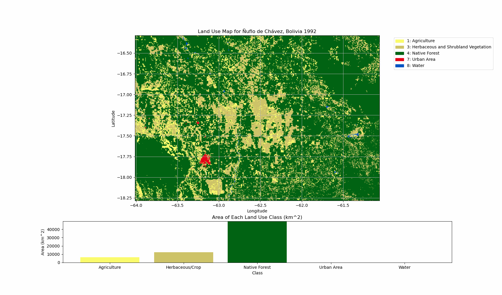
ax0.imshow(colored_new_image, extent=[x_min, x_max, y_min, y_max])
ax0.set_title('Land Use Map for Ñuflo de Chávez, Bolivia ' + filepath[-8:-4])
ax0.set_xlabel('Longitude')
ax0.set_ylabel('Latitude')
# Plot the bar chart
ax1 = plt.subplot(gs[1])
labels = [class_names[cls] for cls in unique]
ax1.bar(labels, area, color=[np.array(new_colormap[cls])/255 for cls in unique])
ax1.set_title('Area of Each Land Use Class (km²)')
ax1.set_xlabel('Class')
ax1.set_ylabel('Area (km²)')
ax1.set_ylim([0, max_area])
# Save the figure
png_path = filepath[:-4] + '.png'
plt.savefig(png_path)
plt.close()
frames.append(Image.open(png_path))
Step 9: Create an Animated GIF
Finally, we'll combine all the yearly images into an animated GIF to visualize changes over time:
# Create GIF animation
gif_path = "land_use_change.gif"
frames[0].save(gif_path, format='GIF', append_images=frames[1:],
				save_all=True, duration=200, loop=0)

# Clean up temporary files
for filepath in filepaths:
	png_path = filepath[:-4] + '.png'
	if os.path.exists(png_path):
		os.remove(png_path)
Key Insights from Land Cover Analysis
When analyzing your results, look for:
- Agricultural expansion: Increasing yellow areas, often at the expense of green (native forest)
- Deforestation patterns: Loss of green areas, especially along roads or development corridors
- Urban growth: Expansion of red areas near existing settlements
- Water body changes: Changes in blue areas indicating drought conditions or water management
- Transition sequences: For example, forests often transition to agriculture through an intermediate shrubland phase
Conclusion
This method can be applied to any region worldwide to monitor environmental changes, support conservation efforts, or inform land use planning and policy. The results can reveal important trends about how human activities are reshaping landscapes over time.
The code above produces a dynamic visualization that makes it easy to see land cover changes at a glance. For my analysis of Ñuflo de Chávez in Bolivia, the results highlight significant agricultural expansion and forest loss between 1992 and 2020.